Let’s play a bit with Twitter data.
There is a Spanish saying that says “La felicidad va por barrios” which is used like “every dog has its day” but close-to-literally translates into “happiness goes to some neighbours”. Me and some friends wanted to check if happiness in Twitter depends on your neighbourhood too. Yes, I know it is a weak justification for writing software but… ¯_(ツ)_/¯
This is my first python code so don’t be hard on me.
Gathering data
The first thing we did was writing a small python script to fetch data from Twitter.
The relevant lines are like the following
api = twitter.Api(consumer_key=environ.get("TWITTER_CONSUMER_API_KEY"),
                  consumer_secret=environ.get("TWITTER_CONSUMER_API_SECRET"),
                  access_token_key=environ.get("TWITTER_ACCESS_TOKEN"),
                  access_token_secret=environ.get("TWITTER_ACCESS_TOKEN_SECRET"))

for twit in api.GetStreamFilter(locations=flat_locations, languages=['en']):
    if twit['coordinates'] :
        writer.writerow([
            twit['place'].get('name') if twit.get('place') != None else "",
            twit["timestamp_ms"],
            twit["text"].replace('\n',''),
            twit['coordinates']['coordinates'][0],
            twit['coordinates']['coordinates'][1]
        ])
        logger.info(twit["text"])
        csvfile.flush()
    else:
        logger.info('Discarding twit without coordinates')
I focused on twits in English for reasons we will see later. We will be dumping this data into a CSV file. Even if it is not completely optimal we will be flushing on every twit write since I want to be able to download periodically the csv to play with it meanwhile I connect to the stream.
Twitter stream allows you to filter by location and that is what I did. I was studying Spain and Germany so I defined bounding boxes for them. The bounding boxes are far from perfect but that is enough for the moment. The relevant piece of code looks like:
def flatten_array(array):
    return [item for sublist in array for item in sublist]

LOCATIONS = {
    'spain': ['-7.07','36.61','5.14','42.66',
              '-9.36','41.82','-1.58','43.97'],
    'germany': ['6.74','51.80','14.52','54.76',
                '6.15','50.86','14.80','51.80',
                '6.15','49.48','12.34','50.86',
                '8.04','47.50','13.13','49.48'],
}

flat_locations = flatten_array(LOCATIONS)
If you want to calculate your own bounding boxes you can use this web. The twitter API needs the array to be flat. Since I wanted to keep my locations as readable as I could I just create a function to flat the array and passed that to the api call.
Plotting the data to a map
I was using Folium to draw a map of the data I got. I did that because it was super super simple and I wanted something super super simple :D :D :D
Once I got my first map I started just platting markers on the appropriate places.
import csv
import folium

map_osm = folium.Map(location=[47, 0], zoom_start=5)
with open('data/twits.csv', 'r') as csvfile:
    twit_reader = csv.reader(csvfile)
    for row in twit_reader:
        twit_text = row[2]
        folium.Marker([float(row[4]), float(row[3])], popup=twit_text).add_to(map_osm)

map_osm.save('./data/map.html')
So with this tiny magic spell we can show something already. For example:
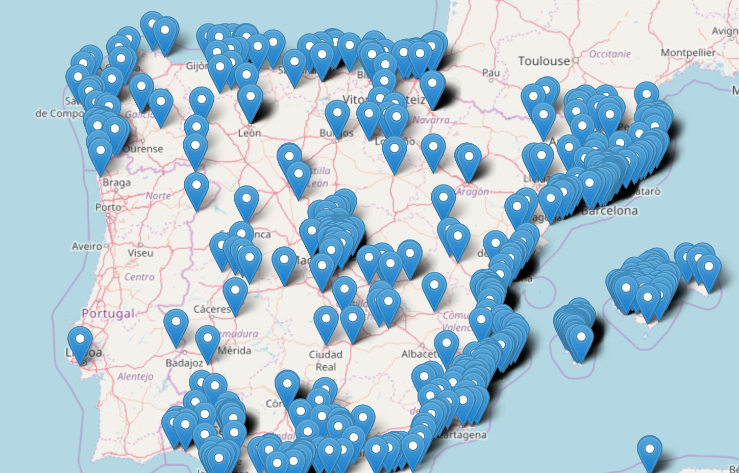
We can see here that the most populated cities in Spain get the most twits as expected. Will they be happy or sad?
Sentiment analysis
Since I am not very good at writing classifiers I will just use scikit-learn as a quick solution to get our sentiment analysis in place. We can create a linear classifier really easily.
I broke the classifier into a training script and another one to apply the analysis since I will be changing my CSV often but I won’t want to retrain the classifier every time.
TEST_SIZE = 10000

logging.basicConfig(level=logging.DEBUG)
logger = logging.getLogger(__name__)

logger.info('Grabbing data')
training_df = pd.read_csv('twit_sentiment_analysis/dataset/Sentiment Analysis Dataset.csv', error_bad_lines=False)
examples_size, _ = training_df.shape

TRAINING_SET_SIZE = examples_size - TEST_SIZE

# Create feature vectors
logger.info('Training predictor. Grab some drinks. This may be long.')
vectorizer = TfidfVectorizer(min_df=5,
                             max_df = 0.8,
                             sublinear_tf=True,
                             use_idf=True)
classifier = svm.LinearSVC()

t0 = time.time()
train_data = training_df.head(TRAINING_SET_SIZE)['SentimentText']
train_vectors = vectorizer.fit_transform(train_data)
train_labels = training_df.head(TRAINING_SET_SIZE)['Sentiment'].map({0: 'negative', 1: 'positive'})
classifier.fit(train_vectors, train_labels)
t1 = time.time()
logger.info("Training took %d seconds", t1-t0)

logger.info("Dumping vectorizer and classifier for future use")
joblib.dump(vectorizer, 'data/vectorizer.pkl')
joblib.dump(classifier, 'data/classifier.pkl')

logger.info("Benchmarking training")
test_data = training_df.tail(TEST_SIZE)['SentimentText']
test_labels = training_df.tail(TEST_SIZE)['Sentiment'].map({0: 'negative', 1: 'positive'})
test_vectors = vectorizer.transform(test_data)
logger.info(classification_report(test_labels, classifier.predict(test_vectors)))
To be honest I still need to tweak the vectorizer since I don’t fully get all the parameters. I used the corpus at Thinknook to train the classifier. At the end I got a 79% of prediction which is not good at all but it is enough for me to have some fun. I will try to improve this in a further blog post.
Once the classifier is trained we can use it with:
logger.info('Loading model')
classifier = joblib.load('data/classifier.pkl')
vectorizer = joblib.load('data/vectorizer.pkl')

logger.info('Starting prediction')
twits_rd = pd.read_csv('data/twits.csv', names=['city', 'user_id', 'text', 'lat', 'long'])

twits_data = twits_rd['text']
twits_vectors = vectorizer.transform(twits_data)
prediction = classifier.predict(twits_vectors)

twits_rd['sentiment'] = prediction
twits_rd.to_csv('data/twits_classified.csv', header=False, index=False)
So using pandas we can easily generate another file ‘data/twits_classified.csv’ with an extra column containing either positive or negative depending on the classification of the tweet.
Plotting the results
Now we have all our data in place. We just need to modify a little bit the code block that does the plot:
for row in twit_reader:
    twit_text = row[2]
    if row[5] == 'positive':
        color = 'green'
        icon = 'smile-o'
    else:
        color = 'red'
        icon = 'frown-o'
    folium.Marker([float(row[4]), float(row[3])], popup=twit_text, icon=folium.Icon(color=color, icon=icon, prefix='fa')).add_to(map_osm)
And there we are:
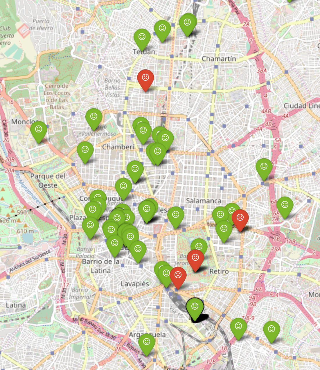
Ready to take a look around to see happy people everywhere.
Conclusions
With this obviously unfinished we can see some things
- People tweets more happy feelings than sad. That great news. Maybe because now it is summer! Probably just displaying in a map won’t give a clear idea on the proportion between happy and sad tweets in an area. I will try a heat map in a following post.
- People in Spain don’t tweet a lot in English :D :D :D but I will analyze that in a different visualization.
- Barcelona and Madrid are the places that send the most tweets in English. Germany’s distribution is much much equally distributed.
- After reading all the data I had to filter out a lot of automatic tweets. There were some bots that tweeted the weather, a lot of Endomodo tweets, some people just posting the location… Cleaning the data a bit was not hard though.
- I got no clue on both machine learning and data visualization. I need to work a lot more on this. :D
- I need to be a lot more tidy while exploring the data I retrieved. Next time I will try different visualizations. I am learning though :)
- This was really fun exercise anyway. You should try on your own!
Have fun!!